Heinous Corner-Rounding of the Day Award (HCROD) #1: Powells Books (div per image)
My sister recently sent me an (online) gift certificate to Powells books. I just love those stores but had never been to the web site. It turns out that the site, like the stores, is exceptionally cool. You can browse for books and then print out a shopping list for your store visit. And there is all kinds of useful organization such as the technical section, and the Portland local section.
So what’s my first thought when encountering such a site (well maybe my second thought – right after “can I preorder my copy of Harry Potter #7”)? Why it’s: “let’s see what Firebug can tell us about the site’s construction” of course! Here’s what I found interesting in about three minutes:
-
the site pretty much uses table-less layout – yippee! divs and floats my friends
-
elastic layout
-
font resizing works pretty well in content areas but not in navigation controls
Something I’m particularly interested in these days is that old chestnut of web design: the rounded corner. The approach on the Powells site was so, well, heinous, that it prompted me to inaugurate what I hope will become a regular feature here. Without further ado, I give you:
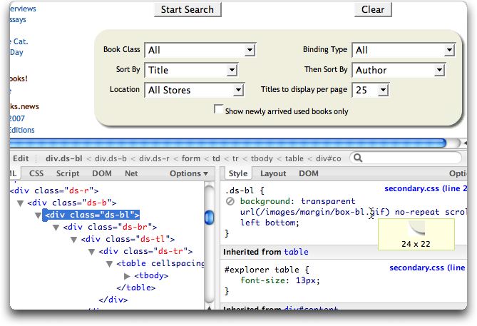
Heinous Corner-Rounding of the Day Award (HCROD) #1: Powells Books (div per image)
Got some content you’d like to render in a rounded box? Well then, simply wrap it in six divs – one each for: right, bottom, and each of the corners. That way you can hang CSS rules on each of those divs to apply your rounded/shadowed images. Semantic HTML my foot. Dig: